

Build a Custom Study from Scratch
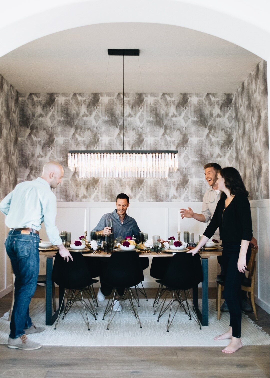
We used our formal dining room for dining only three times in the nearly three years we’ve lived here: two were Thanksgiving, and one was for a photoshoot. Therefore, we decided to give the space new purpose by turning it into a study, and we did so on a pretty tight budget. Here are all the pieces we used to make it happen, as well as some notes about the process!

Here’s a pic from that dinner party photoshoot I’m referring to ^
The “Why”
The year 2021, for us, was the year of renovations. Being stuck at home for most of 2020 helped us better understand how we used all of our own spaces, and it helped me begin to envision a better look and function for each room. Being right off the main entryway, our formal dining room had become a pseudo storage space and drop-all for mail, jackets, packages, things we needed to return, project materials, and decor we no longer used. It was starting to look borderline hoarder-y, and just looking in that direction started giving me anxiety. We needed to give that room a new purpose, and after Jason and I spent an entire year working from the kitchen table and the sofa, taking calls in the music room and basement, and not remembering where we left any of our mail (bills, wedding invitations, birthday cards, etc.), we had both had enough. It was time we created a work space for this home!
A little background
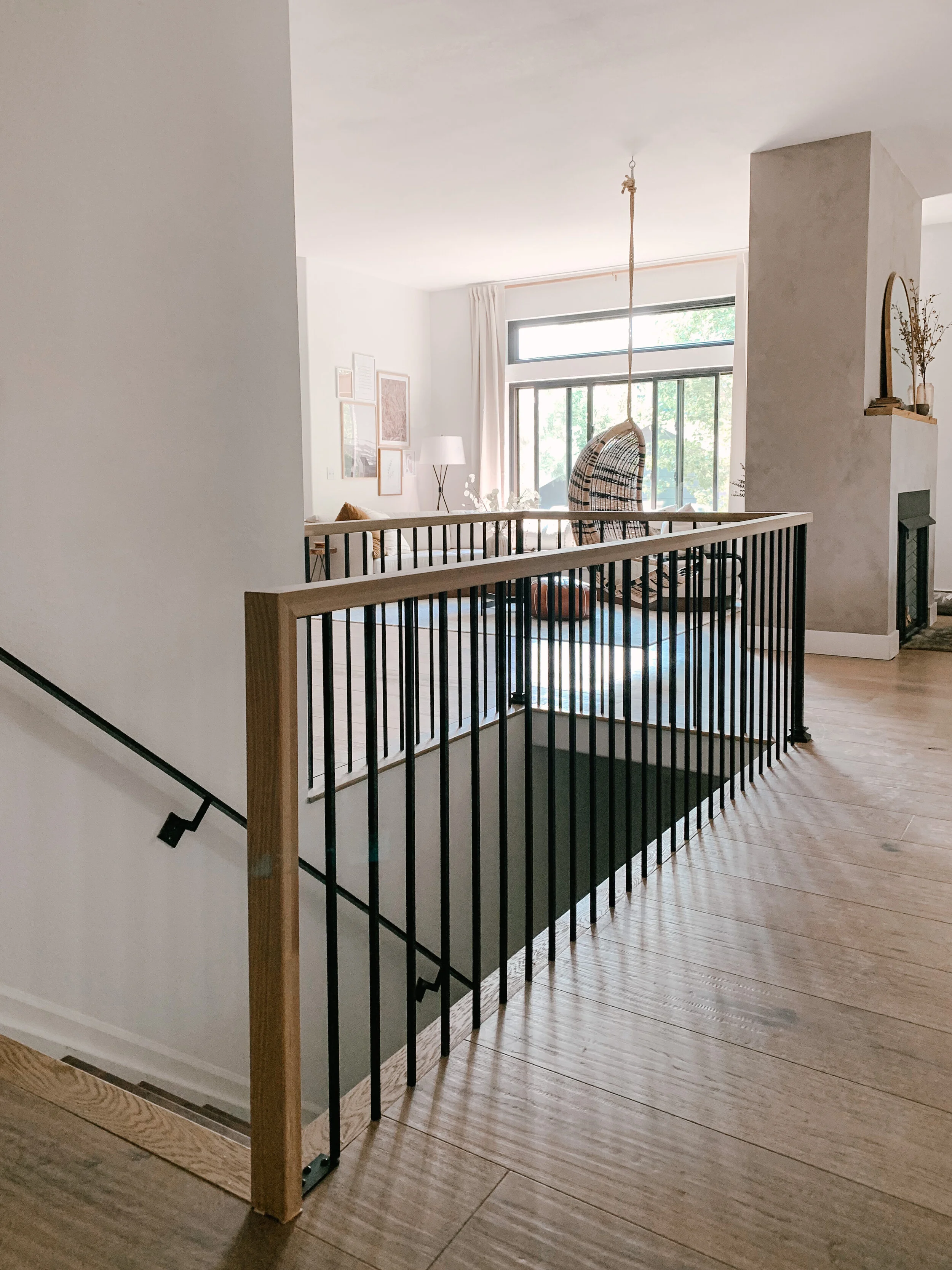
Since moving to this house in March 2019, we’ve been chipping away at the semi-arched enclosure that surrounded the formal dining room. It screamed 1990s to me, and it made the dining room feel dark and cramped. It also blocked a lot of the natural afternoon light that came in from the west-facing windows in the kitchen, living room, and master bedroom. It bothered me every time I walked past it because here I am trying to make this ‘90s house into a 2021 home, but that chunky-clunky wall existed to remind me that this was indeed a 1990s home.


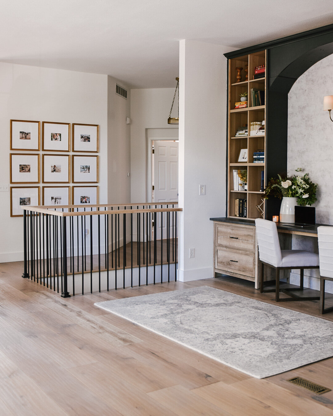
I had been dreaming of opening up this area to bring in more light and open up some sight lines across our main floor (our home is a ranch-style floor plan). As soon as the final wall came down from this formal dining room, we installed a new wrap-around metal and wood railing with a waterfall wood banister at one end, and it dies into the wall on the study end. Jason and I cannot get enough of how much brighter and more spacious our home feels now that this is in place!
On the other side of the dining room is our teeny-tiny laundry room. Good luck coming in through the garage with a bunch of groceries; your bags will most likely break as you squeeze past the washer/dryer on one side and our shoe and coat cubbies on the other side. When Jason and I were discussing what to do with the formal dining room, we decided that no matter what that room ended up being, we should absolutely expand the laundry room into that space a few feet. So we did!

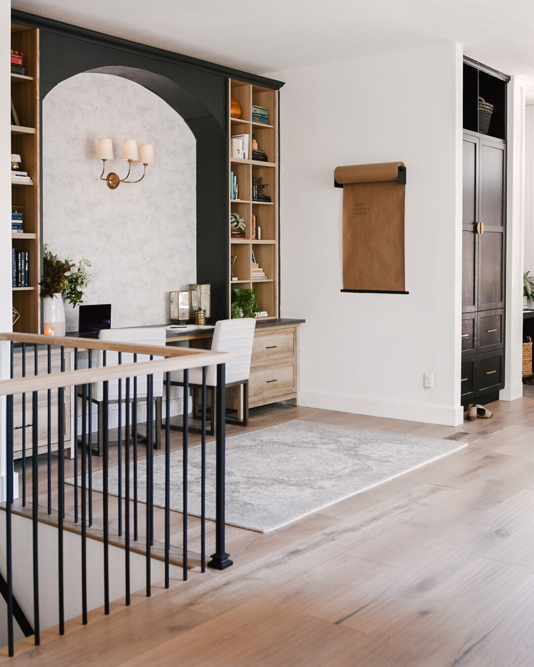
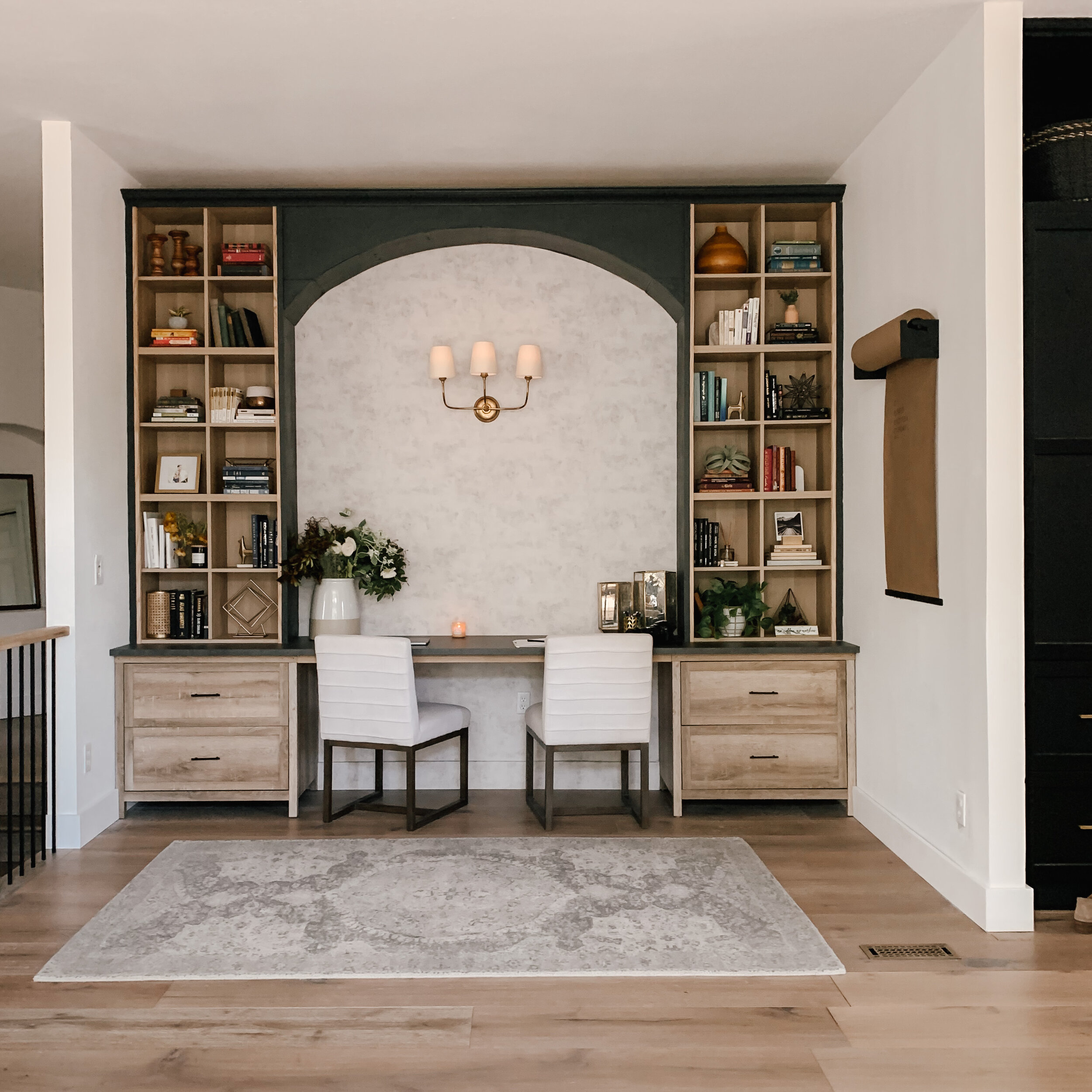
This helped dictate the open, informal layout of the study. With the footprint of this space being changed from 11’ x 11’ to now 11’ W x 7’ D. Not quite deep enough to float a desk in the middle of the space with a chair behind it, plus Jason and I both wanted our own little zones. We also have a decent collection of books that have been stashed away in boxes for about five years now, and new books tend to pile up underneath our nightstands, so we needed bookshelves. After sketching out a few ideas how how we’d incorporate bookshelves and two desks in this new space, the look we landed on was bookshelves on the sides (an IKEA hack!), and a floating desk wide enough for two chairs in the middle. We also decided to honor the home’s original architecture by mimicking one of the arches in the opening along the top, but this was also in part because the ceilings are so high in this home (10’), and it felt a bit unfinished not having something to draw the eye up in between the tall bookcases.
Get the look!
What you’ll need:
Without further ado, here are the pieces we used to bring this new study to life, followed by a brief tutorial:
x2 Issac 2-Drawer Lateral Filing Cabinet by Sand and Stable, from Wayfair (I removed the decorative metal pieces along the top)
x2 Rolls of A-Street Prints x Zio and Sons Artisan Plaster Texture Wallpaper in Aged White
x6 IKEA EKET cubbies in Stained Oak Effect (bonus!! These cubby boxes feature a no-tool assembly!)
x1 IKEA 98” EKBACKEN Concrete Effect Laminate Countertop
Note: I originally sourced a beautiful honed granite from Home Depot with a similar look (it’s called “Silver Pearl Caressed,” from Stonemark), but we weren’t financially in a place where we could justify spending money on granite. We most likely will replace the laminate in a few years after we can save up a little again :)
x2 Sandeplywood 4’ x 8’ x .5” — Your quantity will depend on your ceiling height and whether or not you’d like to add an arch in the top. If so, the width of your room will also affect the amount of plywood you’ll need.
x4 Trim: 1” x 2” x 8’ Red Oak Board (we ripped these with a table saw to make them 1” x 1” x 8’)
Charcoal paint color: HGSW 1481 Carbonized, semigloss
Wall paint color: SW7004 Snowbound, flat
Wall sconce: Everett Three-Arm Sconce from Serena & Lily (a worthwhile splurge—I had been eyeing this sconce light for nearly four years!)
Stair railing (in case you’re interested in going all-in with this look): Novo’s L.J. Smith Iron and Wood system
Building it:
Assembling this was really easy, actually. First, we assembled the Wayfair file cabinets. That was probably the hardest part of this whole project (Jason might argue the arch was also a little tricky, but that’s not a must-have if you just needed the basic storage components of this DIY study). Next, we clicked together all of the IKEA EKET cubby units. Like I mentioned above: no tools needed! For the countertops, since IKEA doesn’t make one that’s 11’ wide (the width of this space), we centered the 98” piece along the wall, then measured the distance remaining on each end. We then cut the ends off of the 74” piece and butted the finished ends together over the file cabinets, placing the cut/raw edges along the wall so we could caulk them and give the countertop a more finished, built-in look.
Prep and paper the walls next! We only needed two rolls of this beautiful wallpaper. Zio and Sons collaborated with A-Street Prints to create this beautiful collection, and the aged plaster print felt perfect for our home since I had recently hand-painted our fireplace in a similarly toned lime wash paint. We did need to skim-coat the new wall and cover it with Zinsser Shieldz Wallpaper Primer first.
Ready to pull it all together? Start at the bottom and work your way up! We set the file cabinets in the corners, then placed the countertops on top, securing them with 2” construction/cabinet screws. We also hid a 1” x 2” x 6’ wood board along the back wall to brace the countertop and prevent sagging in the middle. You can do this, or install a corbel underneath. No matter what you decide to do to support the countertop, be sure to screw that into studs, not just drywall. Stack your EKET cubbies (x3 on each side if your ceiling height allows it), and use a 2”-2.5” construction screws to secure them to the studs in the walls for safety. To give the look of custom built-ins, we used plywood to run down the sides of each stack of cubbies (it hides the lines between each unit), and then applied 1” trim along the front-facing edges and across the seams in the middle. Hiding the lines that give away the fact that these are just little cubby sets goes a long way in making your new bookcases look a bit more high-end. For a more inset look, we added another piece of trim inside the bordering trim, and we painted the outer trim pieces and the plywood charcoal, while keeping the inner trim pieces wood-toned.
The arch truly was a last-minute add-on. What ultimately led to our decision to add it was that the space felt unfinished without something up in the top of the desk area. With 10’ high ceilings and an 11’ wide room, the narrow column of openness in the middle felt like it needed something more. We decided to honor the original architecture of this space by pulling one arch back in, but we modernized it by painting it black. Jason and I both want to smooth out the lines, but this was Jason’s first attempt at creating an arch from scratch, and with a tiny budget and a tight turnaround (we had a magazine photoshoot team coming out in less than 72 hours when we decided to add the arch), I think he did a darn good job :)
Decorate!
Obviously, bookshelves are intended to store books. We had a lot of them, but we didn’t want the shelves to look cluttered. To lend a sense of style here, we sorted our books into a variety of color groupings and then separated them out across all of the cubby holes. We then brought in little decorative objects, plants, and photos to style alongside the books. Our style might not be the same as yours, and that’s okay because we love how this space turned out! Just for fun, here are some before and after photos.
If you love this DIY, save this pic to Pinterest!

